

GoMo: Helping businesses create a mobile friendly website
Posted:
Wednesday, November 2, 2011
(Originally posted on the Google Mobile Ads Blog)
On a crisp fall day, a young person uses his smartphone to find a store that sells scarves. He searches, finds your site, and clicks-thru, prepared to browse your inventory of scarves, or find your store nearby and buy one. But, after he clicks to your site he runs into trouble - it doesn't load fully, and he spends more time zooming-in and squinting than he does looking at scarves! Frustrated, he gives up and looks for another scarf store. You lose a potential customer.
This happens hundreds, even thousands of times every day because most businesses’ websites don’t work well on smartphones. The most important thing you can do to grow your business using the mobile web is to create a mobile-friendly website. So today we’re launching an initiative called GoMo that helps businesses “Go Mobile”.
What’s a mobile-friendly site? It’s a website designed specifically for mobile users and mobile devices. It’s fast to load and easy to use—no pinching and zooming required. Some great examples are right here.
Every day more and more of your customers are looking for you…on mobile devices. If you don’t have a site that works for mobile, you’re missing out. 61% of users are unlikely to return to a site that’s not mobile-friendly.1 On the other hand, customers embrace sites that are built for mobile--consumer engagement increases by 85% with a website designed for mobile devices.2
So, are you ready to Go Mo? Visit howtogomo.com where you’ll find the resources you need to learn about what makes a good mobile site and to start building one.
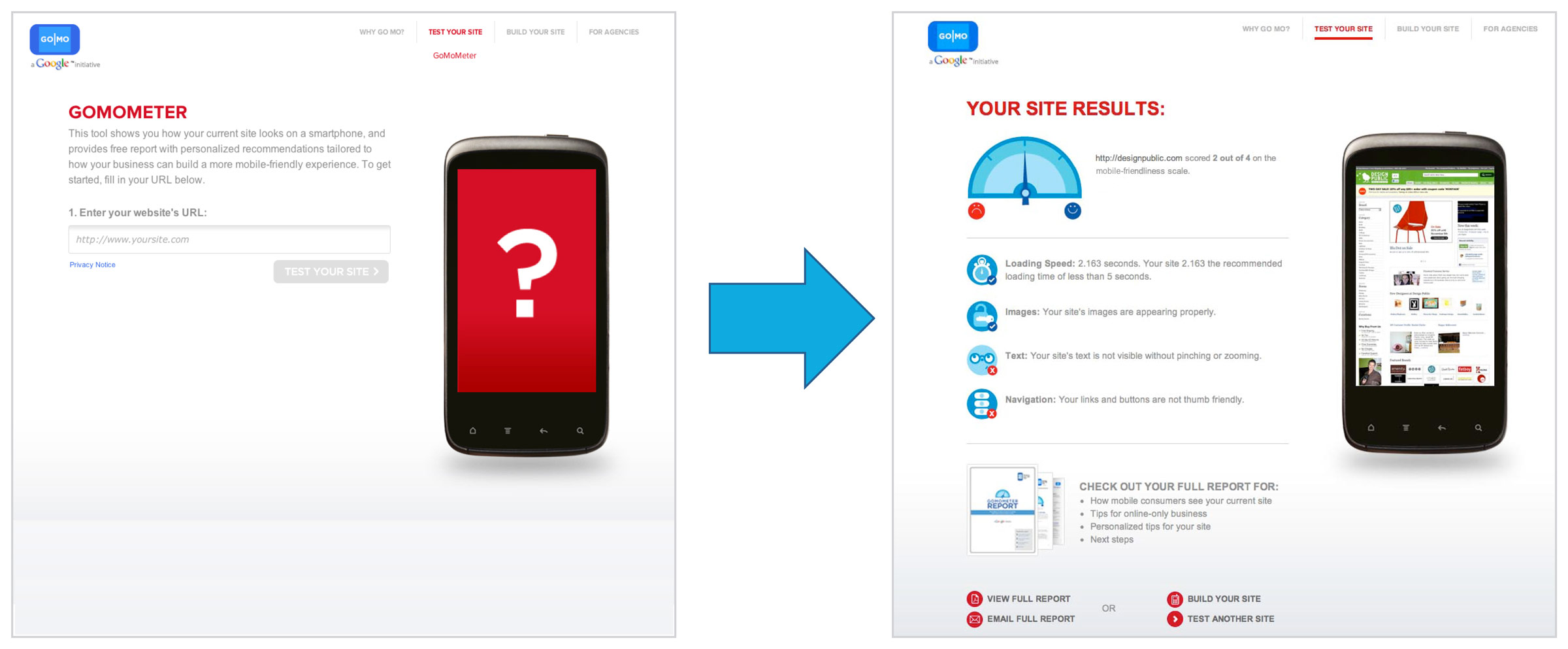 |
| See how your site performs on mobile phones with the GoMoMeter. |
- See what your customers see. Enter a website address into the GoMoMeter and see what your site looks like on a mobile phone. The GoMoMeter will analyze your site and give you customized recommendations on how to make your site more mobile friendly. You can even download a free customized report!
- Learn about why mobile matters: Cool infographics and the latest data will help you learn more about mobile trends and why mobile-friendly sites really matter.
- Get inspired by great examples: Look at the mobile sites of businesses who are doing it right and learn how to make your site better with our ten mobile site best practices.
- Find a mobile site builder who can help: Check out our list of mobile site developers who can help you build your mobile website.
Mobile is critical to your business, and now GoMo makes it easy for you to make your mobile-friendly site. So, no more excuses! Check out howtogomo.com and Go Mobile!
1,2Compuware and Brand Anywhere and Luth Research